Latest Posts

AI Worldbuilding Contest – Future Life Institute

This blog post is written by CDT Students Tashi Namgyal and  Vanessa  Hanschke.

Two Interactive AI CDT students were part of a team that won third place in the AI Worldbuilding Contest run by the Future of Life Institute along with their three non-CDT teammates. In this blog post, we would like to tell you more about the competition, its goals and our team’s process of creating the submission.

The Future of Life Institute describe themselves as “an independent non-profit that works to reduce extreme risks from transformative technologies, as well as steer the development and use of these technologies to benefit life”. Besides running contests, their work consists of running grants programs for research projects, educational outreach or engaging in AI policymaking internationally and nationally in the US.

The worldbuilding competition was aimed at creating a discussion around a desirable future, in which Artificial General Intelligence (AI that can complete a wide range of tasks roughly as well as humans) played a major role in shaping the world. The deliverables included a timeline of events until 2045, two “day in the life” short stories, 13 answers to short question prompts and a media piece.

While dystopian or utopian visions of our future are quite commonplace in science fiction, the particular challenge of the competition was to provide an account of the future that was both plausible and hopeful. This formulation raised a lot of questions such as: For whom will the future be hopeful in 2045? How do we resolve or make progress towards existing crises such as climate change that threaten our future? We discussed these questions at length in our meetings before we even got to imagining concrete future worlds.

Our team was composed of different backgrounds and nationalities: we had two IAI CDT PhD students, one civil servant, one Human Computer Interaction researcher and one researcher in Creative Informatics. We were brought together by our shared values, interests, friendship, and our common homes, Bristol and Edinburgh. We tried to exploit these different backgrounds to provide a diverse picture of what the future could look like. We generated future visions for domains that could be influenced by Artificial General Intelligence (AGI), that are often low-tech, but a core part of human society such as art and religion.

To fit the project into our full-time working week, we decided that we would meet weekly during the brainstorming phase to collect ideas and create drafts for stories, events and question prompts on a Miro board. Each week we would also set each other small tasks to build a foundation of our world in 2045, for example everyone had to write a day in the life story for their own life in 2045. We then chose a weekend closer to the deadline, where we had a “Hackathon”-like intense two days to work on more polished versions of all the different parts of the submission. During this weekend we went through each other’s answers, gave each other feedback and made suggestions to make the submission more cohesive. Our team was selected as one of the 20 finalists out of 144 entries and there was a month for the public to give feedback on whether people felt inspired by or would like to live in such worlds, before the final positions were judged by FLI.

Thinking about how AI tools may be used or misused in the future is a core part of the Interactive AI CDT. The first-year taught module on Responsible AI introduces concepts such as fairness, accountability, transparency, privacy and trustworthiness in relation to AI systems. We go through case studies of where these systems have failed in each regard so we can see how ethics, law and regulation apply to our own PhD research, and in turn how our work might impact these things in the future. In the research phase of the programme, the CDT organises further workshops on topics such as Anticipation & Responsible Innovation and Social & Ethical Issues and there are international conferences in this area we can join with our research stipends, such as FAccT.

If you are curious, you can view our full submission here or listen to the podcast, which we submitted as media piece here. In our submission, we really tried to centre humanity’s place in this future. In summary, the world we created was to make you feel the future, really imagine your place in 2045. Current big tech is not addressing the crises of our times including inequality, climate change, war, and pestilence. Our world seeks to imagine a future where human values are still represented – our propensity for cooperation, creativity, and emotion. But we had to include a disclaimer for our world: our solutions are still open to risk of human actors using them for ill purposes. Our solution for regulating AGI was built on it being an expensive technology in the hand of few companies and regulated internationally, but we tried to think beyond the bounds of AGI. We imagine a positive future grounded in a balanced climate, proper political, social and economic solutions to real world problems, and where human dignity is maintained and respected.


Understanding Dimensionality Reduction

This blog post is written by CDT Student Alex Davies

Sometimes your data has a lot of features. In fact, if you have more than three, useful visualisation and understanding can be difficult. In a machine-learning context high numbers of features can also lead to the curse of dimensionality and the potential for overfitting. Enter this family of algorithms: dimensionality reduction.

The essential aim of a dimensionality reduction algorithm is to reduce the number of features of your input data. Formally, this is a mapping from a high dimensional space to low dimensional. This could be to make your data more concise and robust, for more efficient applications in msachine-learning, or just to visualise how the data “looks”.

There are a few broad classes of algorithm, with many individual variations inside each of these branches. This means that getting to grips with how they work, and when to use which algorithm, can be difficult. This issue can be compounded when each algorithm’s documentation focuses more on “real” data examples, which is hard for humans to really grasp, so we end up in a situation where we are using a tool we don’t fully understand to interpret data that we also don’t understand.

The aim of this article is to give you some intuition into how different classes of algorithm work. There will be some maths, but nothing too daunting. If you feel like being really smart, each algorithm will have a link to a source that gives a fully fleshed out explanation.

How do we use these algorithms?

This article isn’t going to be a tutorial in how to code with these algorithms, because in general its quite easy to get started. Check the following code:

import numpy as np
import matplotlib.pyplot as plt
from sklearn.datasets import load_digits
from sklearn.manifold import TSNE

#    Load the data, here we're using the MNIST dataset
digits     = load_digits()

#    Load labels + the data (here, 16x16 images)
labels     = digits["target"]
data       = digits["data"]

#    Initialise a dimensionality model - this could be sklearn.decomposition.PCA or some other model
TSNE_model = TSNE(verbose = 0)
#    Apply the model to the data
embedding  = TSNE_model.fit_transform(data)

#    Plot the result!
fig, ax = plt.subplots(figsize = (6,6))
for l in np.unique(labels):
    ax.scatter(*embedding[labels == l,:].transpose(), label = l)
ax.legend(shadow = True)
plt.show()

/Users/alexdavies/miniforge3/envs/networks/lib/python3.9/site-packages/sklearn/manifold/_t_sne.py:780: FutureWarning: The default initialization in TSNE will change from 'random' to 'pca' in 1.2.
  warnings.warn(

/Users/alexdavies/miniforge3/envs/networks/lib/python3.9/site-packages/sklearn/manifold/_t_sne.py:790: FutureWarning: The default learning rate in TSNE will change from 200.0 to 'auto' in 1.2.
  warnings.warn(

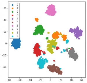
The data we’re using is MNIST, a dataset of 16×16 monochrome hand-written digits from one to ten. I’ll detail how TSNE works later on. Admittedly this code is not the tidiest, but a lot of it is also just for a nice graph at the end. The only lines we dedicated to TSNE were the initial import, calling the model, and using it to embed the data.

We still have the issue, though, of actually understanding the data. Here its not too bad, as these are images, but in other data forms we can’t really get to grips with how the data works. Ideally we’d have some examples of how different algorithms function when applied to data we can understand…

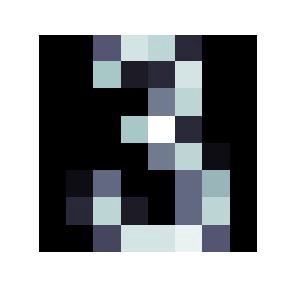
An image from the MNIST dataset, here of the number 3

Toy examples

Here are some examples of how different algorithms function apply to data we can understand. I’d credit this sklearn page on clustering as inspiration for this figure.

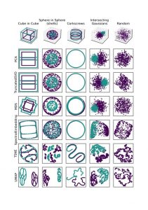
Toy 3D data, and projections of it by differerent algorithms. All algorithms are run with their default parameters.

The examples down the first column are the original data in 3D. The other columns are how a given algorithm projects these examples down into scatter-plot-able 2D. Each algorithm is run with its default parameters, and these examples have in part been designed to “break” each algorithm.

We can see that PCA (Principle Component Analysis) and TruncatedSVD (the sklearn version of Singular Value Decomposition) function like a change in camera angle. MDS (Multi-Dimensional Scaling) is a little more odd, and warps the data a little. Spectral Embedding has done a similar thing to MDS.

Things get a little weirder when we get onto TSNE (T-Stochastic Neighbours Embedding) and UMAP (Uniform Manifold Approximation and Projection). The data doesn’t end up looking much like the original (visually), but they have represented something about the nature of the data, often separating the data where appropriate.

PCA, SVD, similar

This is our first branch of the dimensionality reduction family tree, and are often the first dimensionality reduction methods people are introduced to, in particular PCA. Assuming we’re in a space defined by basis vectors V, we might want to find the most useful (orthogonal) combination of these basis vectors U, as in u = α v + β v+

V here can be thought of our initial angle to the axes of the data, and U a “better” angle to understand the data. This would be called a “linear transform”, which only means that a straight line in the original data will also be a straight line in the projection.

Linear algebra-based methods like SVD and PCA try and use a mathematical approach to find the optimum form of for a set of data. PCA and SVD aim to find the angle that best explain the covariance of the data. There’s a lot of literature out there about these algorithms, and this isn’t really the place for mathematic discussion, but I will give some key takeaways.

A full article about PCA by Tony Yiu can be found here, and here’s the same for SVD by Hussein Abdulrahman.

Firstly, these algorithms don’t “change” the data, as shown in the previous section. All they can do is “change the angle” to one that hopefully explains as much as possible about the data. Secondly, they are defined by a set of equations, and there’s no internal optimisation process beyond this, so you don’t need to be particularly concerned about overfitting. Lastly, each actually produces the same number of components (dimensions) as your original data, but ordered by how much covariance that new component explains. Generally you’ll only need to use the first few of these components.

We can see this at play in that big figure above. All the results of these algorithms, with a little thought, are seen to explain the maximum amount of variance. Taking the corkscrews as an example, both algorithms take a top down view, ignoring the change along the z axis. This is because the maximum variance in the data is the circles that the two threads follow, so a top down view explains all of this variance.

For contrast, here’s PCA applied to the MNIST data:

PCA applied to the MNIST data

Embeddings (MDS, Spectral Embedding, TSNE, UMAP)

The other branch of this family of algorithms are quite different in their design and function to the linear algebra-based methods we’ve talked about so far. Those algorithms look for global metrics — such as covariance and variance — across your data. That means they can be seen as taking a “global view”. These algorithms don’t necessarily not take a global view, but they have a greater ability to represent local dynamics in your data.

We’ll start with an algorithm that bridges the gap between linear algebra methods and embedding methods: Spectral Embedding.

Spectral Embedding

Often in machine-learning we want to be able to separate groups within data. This could be the digits in the MNIST data we’ve seen so far, types of fish, types of flower, or some other classification problem. This also has applications in grouping-based regression problems.

The problem (sometimes) with the linear-algebra methods above is that sometimes the data just isn’t that easily separable by “moving the camera”. For example take a look at the sphere-in-sphere example in that big figure above: PCA and SVD do not separate the two spheres. At this point it can be more practical to instead consider the relationships between individual points.

Spectral Embedding does just this: it measures the distance between a given number of neighbours. What we’ve actually done here is make a graph (or network) that represents the relationships between points. A simple example of building a distance-graph is below.


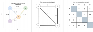
A very simple example of making a distance-graph and a distance-matrix

Our basic aim is to move to a 2D layout of the data that best represents this graph, which hopefully will show how the data “looks” in high dimensions.

From this graph we construct a matrix of weights for each connection. Don’t get too concerned if you’re not comfortable with the term “matrix”, as this is essentially just a table with equal numbers of rows and columns, with each entry representing the weight of the connection between two points.

In spectral embedding these distances are then turned into “weights”, often by passing through a normal distribution or simply binary edges. Binary edges would have [1 = is neighbour, 0 = is not neighbour]. From the weight matrix we apply some linear algebra. We’ll call the weight matrix W.

First we build a diagonal matrix (off diagonal = 0) by summing across rows or columns. This means that each point now has a given weight, instead of weights for pairs of points. We’ll call this diagonal weight matrix D.

We then get the “Laplacian”, L = D-W. The Laplacian is a difficult concept to summarise briefly, but essentially is a matrix that represents the weight graph we’ve been building up until now. Spectral Embedding then performs an “eigenvalue decomposition”. If you’re familiar with linear algebra this isn’t anything new. If you’re not I’m afraid there isn’t space to have a proper discussion of how this is done, but check this article about Spectral Embedding by Elemento for more information.

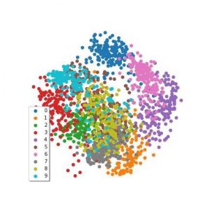
The eigenvalue decomposition produces a nice set of eigenvectors, one for each dimension in the original data, and like in PCA and SVD, we take the first couple as our dimensionality reduction. I’ve applied a Spectral Embedding to the MNIST data we’ve been using, which is in this figure:

Spectral Embedding applied to the MNIST digits dataset from sklearn

Interpreting spectral embeddings can be tricky compared to other algorithms. The important thing to bear in mind is that we’ve found the vectors that we think best describe the distances between points.

For a bit more analysis we can again refer to that big figure near the start. Firstly, to emphasise that we’re looking at distances, check out the cube-in-cube and corkscrews examples. The projections we’ve arrived at actually do explain the majority of the distances between points. The cubes are squashed together — because the distances between cubes is far less than the point-to-point diagonal distance. Similarly the greatest variation in distance in the corkscrew example is the circular — so that’s what’s preserved in our Spectral Embedding.

As a final observation have a look at what’s happened to our intersecting gaussians. There is a greater density of points at the centre of the distributions than at their intersection — so the Spectral Embedding has pulled apart them apart.

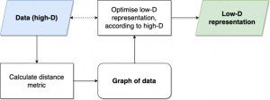
The basic process for (most) embedding methods, for example MDS, UMAP and t-SNE

UMAP, TSNE, MDS

What happens when we don’t solve the dimensionality reduction problem with any (well, some) linear algebra? We arrive at the last general group of algorithms we’ll talk about.

These start much the same as Spectral Embedding: by constructing a graph/network of the data. This is done in different ways by each of these algorithms.

Most simple is MDS, which uses just the distance between all points. This is a computationally costly step, as for N points, we have to calculate O(N²) distances.

TSNE does a similar thing as Spectral Embedding, and moves from distance into a weight of connection, which represents the probability that these two points are related. This is normally done using a normal distribution. Unlike Spectral Embedding or UMAP, TSNE doesn’t consider these distances for a given number of neighbours, but instead draws a bubble around itself and gets distances and weights for all the points in that bubble. It’s not quite that simple, but this is already a long article, so check this article by Kemal Erdem for a full walkthrough.

UMAP considers a fixed number of neighbours for each point, like Spectral Embedding, but has a slightly different way of calculating distances. The “Uniform Manifold” in UMAP means that UMAP is assuming that points are actually uniformly distributed, but that the data-space itself is warped, so that points don’t show this.

Again the maths here is difficult, so check the UMAP documentation for a full walkthrough. Be warned, however, that the authors are very thorough in their explanation. As of May 2022, the “how UMAP works” section is over 4500 words.

In UMAP, TSNE and Spectral Embedding, we have a parameter we can use to change how global a view we want the embedding to take. UMAP and Spectral Embedding are fairly intuitive, where we control simply the number neighbours considered, but in TSNE we use perplexity, which kind of like the size of the bubble around each point.

Once these algorithms have a graph with weighted edges, they try and lay out the graph in a lower number of dimensions (for our purposes this is 2D). They do this by trying to optimise according to a given function. This just means that they try and find the best way to place the nodes in our graph in 2D, according to an equation.

For MDS this is “stress”:

Credit goes to Saul Dobilas article on MDS

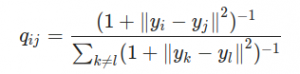
TSNE first calculated the student-t distribution with a single degree of freedom:

The student-t distribution with one degree of freedom, as used by TSNE

Its important to note in the equation above that all are actually vectors, as in the stress equation, so that with those ||a— b|| partswe’re calculating a kind of distance. here is the similarity between points. From here TSNE uses the Kullback-Leibler divergence of the two graphs to measure their similarity. It all gets very mathsy — check out Kemal Erdem’s article for more information.

UMAP again steps up the maths, and optimises the cross-entropy between the low-D and high-D layouts:

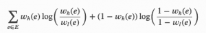
Cross-entropy used by UMAP. Subscript H indicates higher-D, subscript L indicates lower-D

The best explanation of UMAP actually comes from its own documentation. This might be because they don’t distribute it through sklearn.

This can be broken down into a repulsive and attractive “force” between points in the high-D and low-D graphs, so that the layout step acts like a set of atoms in a molecule. Using forces is quite common in graph layouts, and can be intuitive to think about compared to other metrics. It also means that UMAP (in theory) should be able to express both global and local dynamics in the data, depending on your choice of the number of neighbours considered. In practise this means that you can actually draw conclusions about your data from the distance between points across the whole UMAP embedding, including the shape of clusters, unlike TSNE.

It’s been a while without a figure, so here’s all three applied to the MNIST data:

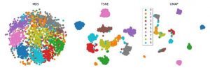
MDS, TSNE and UMAP applied to the sklearn version of the MNIST dataset

We can see that all three seem to have been fairly effective. But how should we understand the results of something that, while optimising the lower-D graph, uses a stochastic (semi-random) process? How do you interpret something that changes based on its random seed? Ideally, we develop an intuition as to how the algorithms function, instead of just knowing the steps of the algorithm.

I’m going to ask you to scroll back up to the top and take another look at the big figure again. Its the last time we do this, I promise.

Firstly, MDS considers all the inter-point relations, so the global shape of data is preserved. You can see this in particular in the first two examples. The inner cube has all of its vertices connected, and the vertices of each cube “line up” with each other (vague, hopefully you see what I mean). There is some disconnection in the edges of the outer cube, and some warping in all the other edges. This might be due to the algorithm trying to preserve distances, but as with all stochastic processes, its difficult to decipher.

UMAP and TSNE also maintain the “lines” of the cube. UMAP is actually successful at separating the two cubes, and makes interesting “exploded diagram” style representations of them. In the UMAP embedding only one of the vertices of each cube is separated. In the TSNE embedding the result isn’t as promising, possibly because the “bubble” drawn by the algorithm around points also catches the points in the other cube.

Both UMAP and TSNE separate the spheres in the second example and the gaussians in the fourth. The “bubble” vs neighbours difference between UMAP and TSNE is also illustrated by the corkscrews example (with a non-default number of neighbours considered by UMAP the result might be more similar). So these algorithms look great! Except there’s always a catch.

Check the final example, which we haven’t touched on before. This is just random noise along each axis. There should be no meaningful pattern in the projections — and the first four algorithms reflect this. SVD, MDS and the Spectral Embedding are actually able to represent the “cube” shape of the data. However, TSNE and UMAP could easily be interpreted as having some pattern or meaning, especially UMAP.

We’ve actually arrived at the classic machine-learning compromise: expressivity vs bias. As the algorithms become more complex, and more able to represent complex dynamics in the data, their propensity to also capture confounding or non-meaningful patterns also becomes greater. UMAP, arguably the most complex of these algorithms, arguably has the greatest expressivity, but also the greatest risk of bias.

Conclusions

So what have we learnt? As algorithms become more complex, they’re more able to express dynamics in the data, but risk also expressing patterns that we don’t want. That’s true all over machine learning, in classification, regression or something else.

Distance-based models with stochastic algorithms (UMAP, TSNE, MDS) represent the relationships between points, and linear-algebra methods (PCA, SVD) take a “global” view, so if you want to make sure that your reduction is true to the data, stick with these.

Parameter choice becomes more important in the newer, stochastic, distance-based models. The corkscrew and cube examples are useful here — a different choice of parameters and we might have had UMAP looking more like TSNE.

Bristol Summer AI day – 30 June 2022

This blog post is written by CDT Students Mauro Comi and Matt Clifford.

For the Bristol summer AI day we were lucky enough to hear from an outstanding group of internationally renowned speakers. The general topic for talks was based around the evaluation of machine learning models. During the day we touched upon a variety of interesting concepts such as: multilabel calibration, visual perception, meta-learning, uncertainty-awareness and the evaluation of calibration. It was an enjoyable and inspiring day and we give a huge thanks to all of the organisers and speakers of the day.

Capability Oriented Evaluation of Models

The day’s talks opened with Prof. José Hernández-Orallo who presented his work around evaluating the capabilities of models rather than their aggregated performance. Capability and performance are two words in machine learning evaluation that are often mistakenly used interchangeably.

Capabilities are a more concrete evaluation of a model which can tell us the prediction of a model’s success on an instance level. This is crucial and reassuring for safety critical applications where knowing the limits of use for a model is essential.

Evaluation of classifier calibration

Prof. Meelis Kull gave a pragmatic demonstration of how the errors of calibration can be determined. After giving us an overview of the possible biases when estimating the calibration error from a given test set, he explained a new paradigm ‘fit-on-the-test’. This approach reduces some biases such as those due to arbitrary binning choices of the probability space.

A Turing Test for Artificial Nets devoted to vision

Jesus’ presented work focused on understanding the visual system. Deep neural networks are the current state of the art in machine vision tasks, taking some degree of inspiration from the human visual system. However, using deep neural networks to understand the visual system is not easy.

Their work proposes an easy-to-use test to determine if human-like behaviour emerges from the network. Which, in principle, is a desirable property of a network that is designed to perform similar tasks that the human brain conducts, such as image segmentation and object classification.

The experiments are a Turing style set of tests that the human visual system is known to pass. They provide a notebook style test bed on GitHub. In theory, if your network that is operating on the visual domain passes the tests then it is regarded as having a competent understanding of the natural visual world.

The evaluation procedures were later explained by Jesus’ PhD students Jorge and Pablo. They take two networks: PerceptNet and a UNet variation, and with them determine the level of similarity to the human visual system. They test known features that occur and that are processed by the human visual system when shown in natural images such as Gabor filter edge outputs and luminosity sensitive scaling. The encoded representations of the images from PerceptNet and UNet are then compared to what is found in the human visual system to illustrate any discrepancies.

This work into evaluating networks’ understanding of natural imaging is useful for justifying decisions such as architecture design and what knowledge a network has learnt.

Uncertainty awareness in machine learning models

Prof. Eyke Hullermeier’s talk expanded on the concept of uncertainty awareness in ML model. ML classifiers tend to be overconfident on their predictions, and this could lead to harmful behaviours, especially in safety-critical contexts. Ideally, we want a ML system to give us an unbiased and statistically reliable estimation of their uncertainty. In simpler words, we want our model to tell us “I am not sure about this”.

When dealing with uncertainty, it is important to distinguish the aleatoric uncertainty, due to stochasticity in the data, from the epistemic one, which is caused by lack of knowledge. However, Prof. Hullermeier explains that it’s often hard to discern the source of uncertainty in real-world scenarios. The conversation moves from a frequentist to a Bayesian perspective of uncertainty, and dives into different levels of probability estimation.

ML for Explainable AI

Explainability is a hot topic in Machine Learning nowadays. Prof. Cèsar Ferri presented his recent work on creating accurate and interpretable explanations using Machine Teaching, an area that looks for the optimal examples that a teacher should use to make a learner capture a concept.

This is an interesting concept for machine learning models where the teacher and student scenario has been flipped. Prof. Ferri showed how this concept was applied to make noisy curves representing battery health monitoring more interpretable. This involves selecting an explanation that balances simplicity and persuasiveness to the user in order to convey the information effectively.

Explainability in meta learning and multilabel calibration

Dr. Telmo SIlva Filho expanded the concept of explainability introduced by Prof. Ferri to the meta-learning setting. The first paper that he described suggested a novel method, Local Performance Regions, to extract rules from a predetermined region in the data space and link them to an expected performance.

He then followed, together with Dr. Hao Sang, with a discussion of multilabel classification and calibration, and how multilabel calibration is often necessary due to the limitation of label-wise classification. The novelty in their approach consists in calibrating a joint label probability with consistent covariance structure.

Final Words

Again, we would like to emphasise our gratitude to all of the speakers and organisers of this event and we look forward to the next interactive AI event!

CDT Research Showcase Day 2 – 31 March 2022

This blog post is written by CDT Student Matt Clifford

The second day of the research showcase focused on the future of interactive AI. This, of course, is a challenging task to predict, so the day was spent highlighting three key areas: AI in green/sustainable technologies, AI in education and AI in creativity.

Addressing each of the three areas, we were given introductory talks from industry/academia.

AI in green/sustainable technologies, Dr. Henk Muller, XMOS

Henk is CTO of Bristol based micro chip designers XMOS. XMOS’s vision is to provide low power solutions that enable AI to be deployed onto edge systems rather than being cloud based.

Edge devices benefit from lower latency and cost as well as facilitating a more private system since all computation is executed locally. However, edge devices have limited power and memory capabilities. This restricts the complexity of models that can be used. Models have to be either reduced in size or precision to conform to the compute requirements. For me, I see this as a positive for model design and implementation. Many machine learning engineers quote Occam’s razor as a philosophical pillar to design. But in practice it is far too tempting to throw power-hungry supercomputer resources at problems where perhaps they aren’t needed.

It’s refreshing to see the type of constraints that XMOS’s chips present us with opening the doors for green and sustainable AI research and innovation in a way that many other hardware manufacturers don’t encourage.

AI in Education, Dr. Niall Twomey, Kidsloop

Niall Twomey, AI in Education talk
Niall Twomey, KidsLoop, giving the AI in Education talk

AI for/in/with education helps teachers by providing the potential for personalised assistants in a classroom environment. They would give aid to students when the teacher’s focus and attention is elsewhere.

The most recent work from kidsloop addresses the needs of neurodivergent students, concentrating on making learning more appropriate to innate ability rather than neurotypical standards. There is potential for the AI in education to reduce biases towards neurotypical students in the education system, with a more dynamic method of teaching that scales well to larger classroom sizes. I think that these prospects are crucial in the battle to reduce stigma and overcome challenges associated with neurodivergent students.

You can find the details of the methods used in their paper: Equitable Ability Estimation in Neurodivergent Student Populations with Zero-Inflated Learner Models, Niall Twomey et al., 2022. https://arxiv.org/abs/2203.10170

It’s worth mentioning that kidsloop will be looking for a research intern soon. So, if you are interested in this exciting area of AI then keep your eyes peeled for the announcements.

AI in Creativity, Prof. Atau Tanaka, University of Bristol

Atau Tanaka, AI and Creativity talk, with Peter Flach leading the Q&A session
Atau Tanaka giving the AI and Creativity talk, with Peter Flach leading the Q&A session

The third and final topic of the day was Ai in a creative environment, specifically for music. Atau showcased an instrument he designed which uses electrical signals produced by the body’s muscles to capture a person’s gesture as the input. He assigns each gesture input to a corresponding sound. From here a regression model is fitted, enabling the interpolation between each gesture. This allows novel sounds to be synthesised with new gestures. The sounds themselves are experimental, dissonant, and distant from the original input sounds, yet Atau seems to have control and intent over the whole process.

The interactive ML training process Atau uses glimpses at the tangibility of ML that we rarely get to experiment with. I would love to see an active learning style component to the learning algorithm that would solidify the human and machine interaction further.

Creativity and technology are intertwined at their core and  I am always excited to see how emerging technologies can influence creativity and how creatives find ways to redefine creativity with technology.

Breakout Groups and Plenary Discussion

Discussion groups
Discussion groups during the Research Showcase

After lunch we split into three groups to share thoughts on our favourite topic area. It was great to share opinions and motivations amongst one another. The overall drive for discussion was to flesh out a rough idea that could be taken forward as a research project with motivations, goals, deliverables etc. A great exercise for us first years to undertake before we enter the research phase of the CDT!

Closing Thoughts

I look forward to having more of these workshop sessions in the future as the restrictions of the covid pandemic ease. I personally find them highly inspirational, and I believe that the upcoming fourth IAI CDT cohort will be able to benefit significantly from having more in person events like these workshops. I think that they will be especially beneficial for exploring, formulating and collaborating on summer project ideas, which is arguably one of the most pivotal aspects of the CDT.

CDT Research Showcase Day 1 – 30 March 2022

Blog post written by CDT Student Oli Deane.

This year’s IAI CDT Research Showcase represented the first real opportunity to bring the entire CDT together in the real world, permitting in-person talks and face-to-face meetings with industry partners.

Student Presentations

Pecha Kucha presentation given by Grant Stevens
Grant Stevens giving his Pecha Kucha talk

The day began with a series of quickfire talks from current CDT students. Presentations had a different feel this year as they followed a Pecha Kucha style; speakers had ~6 minutes to present their research with individual slides automatically progressing after 20 seconds. As a result, listeners received a whistle-stop tour of each project without delving into the nitty gritty details of research methodologies.

Indeed, this quickfire approach highlighted the sheer diversity of projects carried out in the CDT. The presented projects had a bit of everything; from a data set for analyzing great ape behaviors, to classification models that determine dementia progression from time-series data.

It was fascinating to see how students incorporated interactivity into project designs. Grant Stevens, for example, uses active learning and outlier detection methods to classify astronomical phenomena. Tashi Namgyal has developed MIDI-DRAW, an interactive musical platform that permits the curation of short musical samples with user-provided hand-drawn lines and pictures. Meanwhile, Vanessa Hanschke is collaborating with LV to explore how better ethical practices can be incorporated into the data science workflow; for example, her current work explores an ethical ‘Fire-drill’ – a framework of emergency responses to be deployed in response to the identification of problematic features in existing data-sets/procedures. This is, however, just the tip of the research iceberg and I encourage readers to check out all ongoing projects on the IAI CDT website.

Industry Partners

Gustavo Medina Vazquez's presentation, EDF Energy, with Q&A session being led by Peter Flach
Gustavo Medina Vazquez’s EDF Energy presentation with the Q&A session being led by CDT Director Peter Flach

Next, representatives from three of our industry partners presented overviews of their work and their general involvement with the CDT.

First up was Dylan Rees, a Senior Data Engineer at LV. With a data science team stationed in MVB at the University of Bristol, LV are heavily involved with the university’s research. As well as working with Vanessa to develop ethical practices in data science, they run a cross-CDT datathon in which students battle to produce optimal models for predicting fair insurance quotes. Rees emphasized that LV want responsible AI to be at the core of what they do, highlighting how insurance is a key example of how developments in transparent, and interactive, AI are crucial for the successful deployment of AI technologies. Rees closed his talk with a call to action: the LV team are open to, and eager for, any collaboration with UoB students – whether it be to assist with data projects or act as “guinea pigs” for advancing research on responsible AI in industry.

Gustavo Vasquez from EDF Energy then discussed their work in the field and outlined some examples of past collaborations with the CDT. They are exploring how interactive AI methods can assist in the development and maintenance of green practices – for example, one ongoing project uses computer vision to identify faults in wind turbines. EDF previously collaborated with members of the CDT 2019 cohort as they worked on an interactive search-based mini project.

Finally, Dr. Claire Taylor, a representative from QINETIQ, highlighted how interactive approaches are a major focus of much of their research. QINETIC develop AI-driven technologies in a diverse range of sectors: from defense to law enforcement,  aviation to financial services. Dr. Taylor discussed the changing trends in AI, outlining how previously fashionable methods that have lost focus in recent years are making a come-back courtesy of the AI world’s recognition that we need more interpretable, and less compute-intensive, solutions. QINETIQ also sponsor Kevin Flannagan’s (CDT 2020 cohort) PhD project in which he explores the intersection between language and vision, creating models which ground words and sentences within corresponding videos.

Academic Partners and Poster Session

Research Showcase poster session

To close out the day’s presentations, our academic partners discussed their relevant research. Dr. Oliver Ray first spoke of his work in Inductive Logic Programming before Dr. Paul Marshall gave a perspective from the world of human computer interaction, outlining a collaborative cross-discipline project that developed user-focused technologies for the healthcare sector.

Finally, a poster session rounded off proceedings; a studious buzz filled the conference hall as partners, students and lecturers alike discussed ongoing projects, questioning existing methods and brainstorming potential future directions.

In all, this was a fantastic day of talks, demonstrations, and general AI chat. It was an exciting opportunity to discuss real research with industry partners and I’m sure it has produced fruitful collaborations.

I would like to end this post with a special thank you to Peter Relph and Nikki Horrobin who will be leaving the CDT for bigger and better things. We thank them for their relentless and frankly spectacular efforts in organizing CDT events and responding to students’ concerns and questions. You will both be sorely missed, and we all wish you the very best of luck with your future endeavors!

January Research Skills Event Review: Day 2

This review is written by CDT Student Oliver Deane.

Day 2 of the IAI CDT’s January Research Skills event included a diverse set of talks that introduced valuable strategies for conducting original and impactful research.

Unifiers and Diversifiers

Professor Gavin Brown, a lecturer at the University of Manchester, kicked things off with a captivating talk on a dichotomy of scientific styles: Unifying and Diversifying.

Calling upon a plethora of quotations and concepts from a range of philosophical figures, Prof. Brown contends that most sciences, and indeed scientists, are dominated by one of these styles or the other. He described how a Unifying researcher focuses on general principles, seeking out commonalities between concepts to construct all-encompassing explanations for phenomena, while  a ‘Diversifier’ ventures into the nitty gritty, exploring the details of a task in search of novel solutions for specific problems. Indeed, as Prof. Brown explained, this fascinating dichotomy maintains science in a “dynamic equilibrium”; unifiers construct rounded explanations that are subsequently explored and challenged by diversifying thinkers. In turn, the resulting outcome fuels unifiers’ instinct to adapt initial explanations to account for the new evidence – and round and round we go.

Examples from the field

Prof. Brown proceeded to demonstrate these processes with example class members from the field. He identifies DeepMind founder, Demis Hassabis, as a textbook ‘Unifier’, utilizing a substantial knowledge of the broad research landscape to connect and combine ideas from different disciplines. Contrarily, Yann LeCun, master of the Convolutional Neural Network, falls comfortably into the ‘Diversifier’ category; he has a focused view of the landscape, specializing on a single concept to identify practical, previously unexplored, solutions.

Relevant Research Strategies

We were then encouraged to reflect upon our own research instincts and understand the degree to which we adopt each style. With this in mind, Prof. Brown introduced valuable strategies that permit the identification of novel and worthwhile research avenues. Unifiers can look under the hood of existing solutions, before building bridges across disciplines to identify alternative concepts that can be reconstructed and reapplied for the given problem domain.  Diversifiers on the other hand should adopt a data centric point of view, challenging existing assumptions and, in doing so, altering their mindset to approach tasks from unconventional angles.

This fascinating exploration into the world of Unifiers and Diversifiers offered much food for thought, providing students practical insights that can be applied to our broad research methodologies, as well as our day-to-day studies.

Research Skills in Interactive AI

After a short break, a few familiar faces delved deeper into specific research skills relevant to the three core components of the IAI CDT: Data-driven AI, Knowledge-Driven AI, and Interactive AI.

Data-Driven AI

Professor Peter Flach began his talk by reframing data-driven research as a “design science”; one must analyze a problem, design a solution and build an artefact accordingly. As a result, the emphasis of the research process becomes creativity; researchers should approach problems by identifying novel perspectives and cultivating original solutions – perhaps by challenging some underlying assumptions made by existing methods. Peter proceeded to highlight the importance of the evaluation process in Machine Learning (ML) research, introducing some key Dos and Don’ts to guide scientific practices: DO formulate a hypothesis, DO expect an onerous debugging process, and DO prepare for mixed initial results. DON’T use too many evaluation metrics – select an appropriate metric given a hypothesis and stick with it. AVOID evaluating to favor one method over another to remove bias from the evaluation process; “it  is not the Olympic Games of ML”.

Knowledge-Based AI

Next, Dr. Oliver Ray covered Knowledge -based AI, describing it as the bridge between weak and strong AI. He emphasized that knowledge-based AI is the backbone for building ethical models, permitting interpretability, explainability, and, perhaps most pertinent, interactivity. Oliver framed the talk in the context of the Hypothetico-deductive model, a description of scientific method in which we curate a falsifiable hypothesis before using it to explore why some outcome is not as expected.

Interactive AI

Finally, Dr. Paul Marshall took listeners on a whistle-stop tour of research methods in Interactive AI, focusing on scientific methods adopted by the field of Human-Computer Interaction (HCI). He pointed students towards formal research processes that have had success in HCI. Verplank’s Spiral, for example, takes researchers from ‘Hunch’ to ‘Hack’, guiding a path from idea, through design and prototype, all the way to a well-researched solution or artefact. Such practices are covered in more detail during a core module of the IAI training year: ‘Interactive Design’.

In all, this was a useful and engaging workshop that introduced a diverse set of research practices and perspectives that will prove invaluable tools during the PhD process.

January Research Skills Event Review: Day 1

January Research Skills – Day 1

This review is written by CDT Isabella Degen, @isabelladegen

The first day of the January Research Skills event was about academic web presence. On the agenda were:

  • a presentation on academic blogging and social media by Gavin
  • a group discussion about our experiences
  • a hackathon to extend an authoring platform that makes it easy to publish academic content on the web organised by Benjamin and Tashi

Academic web presence

In his talk, Gavin shared his experience of blogging and tweeting about his research. His web presence is driven by his passion for writing.

I particularly like Gavin’s practice of writing a thread on Twitter for each of his academic papers. I think summarising a complex paper into a few approachable tweets helps to focus on the most important points of the work and provides clarity.

Hackathon

For the hackathon we looked at an authoring platform that can be used to easily publish our work on the Center of Doctoral Training’s website. The aim of the websites is to be a place where people internal and external to the CDT can explore what we all are working on.

The homepage-dev codebase served as starting point. It uses Jekyll as a static site generator. A blog post is written as a markdown file. It can include other online content like PDFs, videos, Jupyter notebooks, Reveal.js presentations, etc. through a Front Matter) template. Uploading the markdown file to an online code repository triggers the publishing workflow.

It only took us a few minutes to get a github.io page started using this setup. We didn’t extend the workflow beyond being able to write our own blogs using what’s already been setup.

At the end we discussed using such a workflow to not repeat the same content for different purposes over and over again. The idea is to apply the software development principle of “DRY” to written content, graphs and presentations. Creating a workflow that keeps all communications about the same research up to date. You can read more about it on: You only Write Thrice.

Takeaway

The event got me thinking about having a web presence dedicated to my research. I’m inspired by sharing clear and concise pieces of my research and how in return this could bring a lot of clarity to my work.

If you are somebody who reads or writes about research on platforms like Twitter, LinkedIn or in your own blog I’d love to hear about your experiences.

BIAS Day 1 Review: ‘Interactive AI’

This review of the 2nd day of the BIAS event, ‘Interactive AI’, is written by CDT Student Vanessa Hanschke

The Bristol Interactive AI Summer School (BIAS) was opened with the topic of ‘Interactive AI’, congruent with the name of the hosting CDT. Three speakers presented three different perspectives on human-AI interactions.

Dr. Martin Porcheron from Swansea University started with his talk “Studying Voice Interfaces in the Home”, looking at AI in one of the most private of all everyday contexts: smart speakers placed in family homes. Using an ethnomethodological approach, Dr. Porcheron and his collaborators recorded and analysed snippets of family interactions with an Amazon Echo. They used a purpose-built device to record conversations before and after activating Alexa. While revealing how the interactions with the conversational AI were embedded in the life of the home, this talk was a great reminder of how messy real life may be compared to the clean input-output expectations AI research can sometimes set. The study was also a good example of the challenge of designing research in a personal space, while respecting the privacy of the research subjects.

Taking a more industrial view of human-AI interactions, Dr Alison Smith-Renner from Dataminr followed with her talk “Designing for the Human-in-the-Loop: Transparency and Control in Interactive ML”. How can people collaborate with an ML (Machine Learning) model to achieve the best outcome? Dr. Smith-Renner used topic modelling to understand the human-in-the-loop problem with respect to these two aspects: (1) Transparency: methods for explaining ML models and their results to humans. And (2) Control: how users can provide feedback to systems. In her work, she looks at how users are affected by the different ways ML can apply their feedback and if model updates are consistent with the behaviour the users anticipate. I found particularly interesting the different expectations the participants of her study had of ML and how the users’ topic expertise influenced how much control they wanted over a model.

Finally, Prof. Ben Shneiderman from the University of Maryland concluded with his session titled “Human-Centered AI: A New Synthesis” giving a broader view on where AI should be heading by building a bridge between HCI (Human-Computer Interaction) and AI. For the question of how AI can be built in a way that enhances people, Prof. Shneiderman presented three answers: the HCAI framework, design metaphors and governance structures, which are featured in his recently published book. Hinting towards day 4’s topic of responsible AI, Prof. Shneiderman drew a compelling comparison between safety in the automobile industry and responsible AI. While often unlimited innovation is used as an excuse for a deregulated industry, regulation demanding higher safety in cars led to an explosion of innovation of safety belts and air bags that the automobile industry is now proud of. The same can be observed for the right to explainability in GDPR and the ensuing innovation in explainable AI. At the end of the talk, Prof. Shneiderman called to AI researchers to create a future that serves humans and is sustainable and “makes the world warmer and kinder”.

It was an inspiring afternoon for anyone interested in the intersection of humans and AI, especially for researchers like me trying to understand how we should design interfaces and interactions, so that we can gain the most benefit as humans from powerful AI systems

My Experience of Being a Student Ambassador

This week’s blog post is written by CDT Student Grant Stevens

Widening participation involves the support of prospective students from underrepresented backgrounds to access university. The covered students include, but are not limited to, those:

  • from low-income backgrounds and low socioeconomic groups
  • who are the first in their generation to consider higher education
  • who attend schools and colleges where performance is below the national average
  • who are care experienced
  • who have a disability
  • from underrepresented ethnic backgrounds.

Due to my background and school, I matched the widening participation criteria for universities and was eligible for some fantastic opportunities. Without which I would not be in the position I am today.

I was able to attend a residential summer school in 2012 hosted by the University of Bristol. We were provided with many taster sessions for a wide variety of courses on offer from the university. I had such a good time that I applied the year after to attend the Sutton Trust Summer School, which was also held at Bristol uni.

A bonus of these opportunities was that those who took part were provided with a contextual offer (up to two grades below the standard entry requirement for their course), as well as a guaranteed offer (or guaranteed interview if the course required it). These types of provisions are essential to ensure fair access for those who may be disadvantaged by factors outside of their control. In my case, the reduced offer was vital as my final A-Level grades would have led to me missing out on the standard offer.

Although I enjoyed the taster sessions and loved the city, the conversations I had with the student ambassadors had the most impact on me and my aspirations for university. Hearing about their experiences and what they were working on at university was incredibly inspiring.

Due to how impactful it had been hearing from current students, I signed up to be a student ambassador myself when I arrived at Bristol. It’s a job that I have found very enjoyable and extremely rewarding. I have been very fortunate in having the opportunity to interact with so many people from many different backgrounds.

I am now entering my 7th year as a student ambassador for the widening participation and outreach team. I still really enjoy my job, and throughout this time, I have found that working on summer schools always turns out to be the highlight of my year. I’m not sure whether this is because I know first-hand the impact being a participant on these programmes can have or because over the week, you can really see the students coming out of their shells and realising that they’re more than capable of coming to a university like Bristol.

Being in this role for so long has also made me realise how much of an impact the pandemic can have on these types of programmes. I was relieved that at Bristol, many of these schemes have been able to continue in an online form. The option of 100% online programmes has its benefits but also its limitations. It allows us to expand our audience massively as we no longer have spacing restraints. However, zoom calls cannot replace physically visiting the university or exploring the city when choosing where to study. That’s why hearing from current students about their course and what to expect at university is more important than ever. For this reason, I have started to branch out to help with schemes outside of the university. I have presented talks for schools through the STEM Ambassador programme; I recently gave a talk to over 100 sixth formers during the Engineering Development Trust’s Insight into University course, and I also look forward to working with the Sutton Trust to engage with students outside of just Bristol.

In the last few years since starting my PhD, my message to students has changed a little. It has often been about “what computer science isnt.” clearing up misconceptions about what the subject at uni entails. That is still part of my talks; however, now I make sure to put in a section on how I got where I am today. It wasn’t plane sailing, and definitely not how I would have imagined a “PhD student’s” journey would go: from retaking a whole year in sixth form to having a very poor track record with exams at undergrad. I think it’s really important to let students know that regardless of their background, and even when things really don’t go to plan, it’s still possible to go on to do something big like a PhD. That is something I would’ve loved to hear back in school, so hopefully, it’s useful for those thinking (and potentially worrying) about uni now.

Some of the best people I’ve met and the best memories I’ve had at university have come from my student ambassador events. It’s something I feel very passionate about and find very enjoyable and rewarding. I have been very fortunate with the opportunities that have been available to me and am incredibly grateful as, without them, I wouldn’t be studying at Bristol, let alone be doing a PhD. By being a part of these projects, I hope I can inspire the next set of applicants in the same way my ambassadors inspired me.

Neglected Aspects of the COVID-19 pandemic

This week’s post is written by IAI CDT student Gavin Leech.
I recently worked on two papers looking at neglected aspects of the COVID-19 pandemic. I learned more than I wanted to know about epidemiology.

The first: how much do masks do?

There were a lot of confusing results about masks last year.
We know that proper masks worn properly protect people in hospitals, but zooming out and looking at the population effect led to very different results, from basically nothing to a huge halving of cases.
Two problems: these were, of course, observational studies, since we don’t run experiments on the scale of millions. (Or not intentionally anyway.) So there’s always a risk of missing some key factor and inferring the completely wrong thing.
And there wasn’t much data on the number of people actually wearing masks, so we tended to use the timing of governments making it mandatory to wear masks, assuming that this caused the transition to wearing behaviour.
It turns out that the last assumption is mostly false: across the world, people started to wear masks before governments told them to. (There are exceptions, like Germany.) The correlation between mandates and wearing was about 0.32. So mask mandate data provide weak evidence about the effects of mass mask-wearing, and past results are in question.
We use self-reported mask-wearing instead: the largest survey of mask wearing (n=20 million, stratified random sampling) and obtain our effect estimates from 92 regions across 6 continents. We use the same model to infer the effect of government mandates to wear masks and the effect of self-reported wearing. We do this by linking confirmed case numbers to the level of wearing or the presence of a government mandate. This is Bayesian (using past estimates as a starting point) and hierarchical (composed of per-region submodels).
For an entire population wearing masks, we infer a 25% [6%, 43%] reduction in R, the “reproduction number” or number of new cases per case (B).
In summer last year, given self-reported wearing levels around 83% of the population, this cashed out into a 21% [3%, 23%] reduction in transmission due to masks (C).
One thing which marks us out is being obsessive about checking this is robust; that different plausible model assumptions don’t change the result. We test 123 different assumptions about the nature of the virus, of the epidemic monitoring, and about the way that masks work. It’s heartening to see that our results don’t change much (D)
It was an honour to work on this with amazing epidemiologists and computer scientists. But I’m looking forward to thinking about AI again, just as we look forward to hearing the word “COVID” for the last time.

The second: how much does winter do?

We also look at seasonality: the annual cycle in virus potency. One bitter argument you heard a lot in 2020 was about whether we’d need lockdown in the summer, since you expect respiratory infections to fall a lot in the middle months.

We note that the important models of what works against COVID fail to account for this. We look at the dense causal web involved:

This is a nasty inference task, and data is lacking for most links. So instead, we try to directly infer a single seasonality variable.
It looks like COVID spreads 42% less [25% – 53%, 95% CI] from the peak of winter to the peak of summer.
Adding this variable improves two of the cutting-edge models of policy effects (as judged by correcting bias in their noise terms).
One interesting side-result: we infer the peak of winter, we don’t hard-code it. (We set it to the day with the most inferred spread.) And this turns out to be the 1st January! This is probably coincidence, but the Gregorian calendar we use was also learned from data (astronomical data)…
See also
  • Gavin Leech, Charlie Rogers-Smith, Jonas B. Sandbrink, Benedict Snodin, Robert Zinkov, Benjamin Rader, John S. Brownstein, Yarin Gal, Samir Bhatt, Mrinank Sharma, Sören Mindermann, Jan M. Brauner, Laurence Aitchison

Seasonal variation in SARS-CoV-2 transmission in temperate climates

  • Tomas Gavenciak, Joshua Teperowski Monrad, Gavin Leech, Mrinank Sharma, Soren Mindermann, Jan Markus Brauner, Samir Bhatt, Jan Kulveit
  • Mrinank Sharma, Sören Mindermann, Charlie Rogers-Smith, Gavin Leech, Benedict Snodin, Janvi Ahuja, Jonas B. Sandbrink, Joshua Teperowski Monrad, George Altman, Gurpreet Dhaliwal, Lukas Finnveden, Alexander John Norman, Sebastian B. Oehm, Julia Fabienne Sandkühler, Laurence Aitchison, Tomáš Gavenčiak, Thomas Mellan, Jan Kulveit, Leonid Chindelevitch, Seth Flaxman, Yarin Gal, Swapnil Mishra, Samir Bhatt & Jan Markus Brauner